If your online store isn’t converting the way you hoped, your homepage might be part of the problem.
You only get one chance to make a first impression, and for most shoppers, your homepage is it. The truth is, many eCommerce businesses unintentionally lose sales by making small homepage mistakes that turn off potential buyers. The good news? They’re usually easy to fix.
Here’s how to make your homepage work smarter—and harder—for your business.
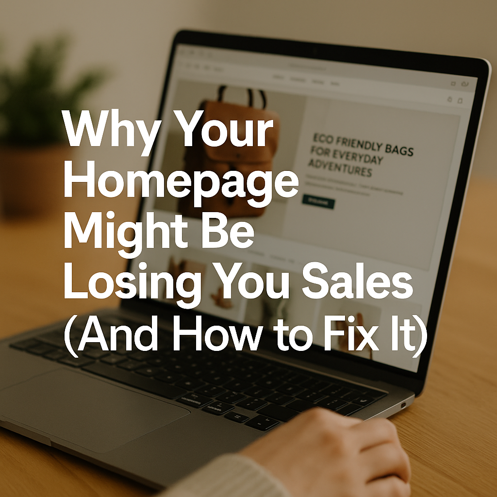
1. You’re Not Telling Visitors What You Actually Do
When someone lands on your homepage, they should instantly know:
- What you sell
- Who it’s for
- Why it’s worth their time
If your headline is vague or your visuals are confusing, people bounce. Fast.
Fix it:
Write a simple, clear headline. Use a subheading to add detail. Add a strong image that shows your product or the lifestyle around it. Don’t make people guess.
Example:
“Eco-Friendly Bags for Everyday Adventures”
Durable, stylish, and made with 100% recycled materials. Free shipping on orders over $50.
2. Too Much Going On at Once
A cluttered homepage overwhelms visitors. Pop-ups, sliders, multiple fonts, and 10 calls-to-action all competing for attention? That’s a recipe for confusion.
Fix it:
Pick one main goal for your homepage—usually to get people browsing or buying. Highlight a few key products, categories, or promotions. Use whitespace and consistent design to guide people naturally through the page.
3. Your Site Isn’t Mobile-Friendly
Over 60% of online shopping happens on phones. If your homepage looks great on desktop but breaks on mobile, you’re losing a big chunk of your audience.
Fix it:
Use a responsive theme. Check your site on several screen sizes. Make sure text is readable, buttons are easy to tap, and images don’t take forever to load.
4. You’re Hiding the Navigation
People want to browse. If they can’t figure out how to get to your products quickly, they’ll leave.
Fix it:
Keep your menu visible and simple. Feature product categories or bestsellers near the top. Add a search bar that actually works. Bonus: show product previews on hover if your builder allows it.
5. No Trust Signals
If your homepage looks generic or unfinished, shoppers get nervous. They need to know your store is legit.
Fix it:
Add trust elements like:
- Customer reviews or star ratings
- Security badges
- “As seen in” press mentions
- Free shipping or return info
- Real photos (not just stock)
Even just adding a customer quote or logo bar can boost credibility.
6. Slow Load Times
If your homepage takes more than 3 seconds to load, you’re likely losing visitors before they even see your store.
Fix it:
Compress your images. Use fewer apps and animations. Pick a fast, reliable theme. And test your speed using free tools like PageSpeed Insights.
Final Thoughts
Your homepage doesn’t have to be flashy. It just needs to be clear, clean, and built to guide visitors toward shopping with confidence.
Think of it like the front window of a store. People walk by and decide—based on a glance—if it’s worth going in.
Make yours inviting. Make it helpful. And most of all, make it obvious what you’re offering and why it matters.
Need help designing a homepage that converts? Get in touch. We’ll help you build a storefront that brings people in—and keeps them coming back.